UX research and discovery
We talk to users, map their goals and pain points, and understand the jobs they are trying to do. Design decisions are driven by evidence, not opinions [citation:6].
Good design is invisible. When a user knows exactly where to click, what happens next and why they should care, that is not luck. It is UX research, thoughtful flows and pixel-perfect UI working together. We design digital products that people understand immediately and enjoy using.
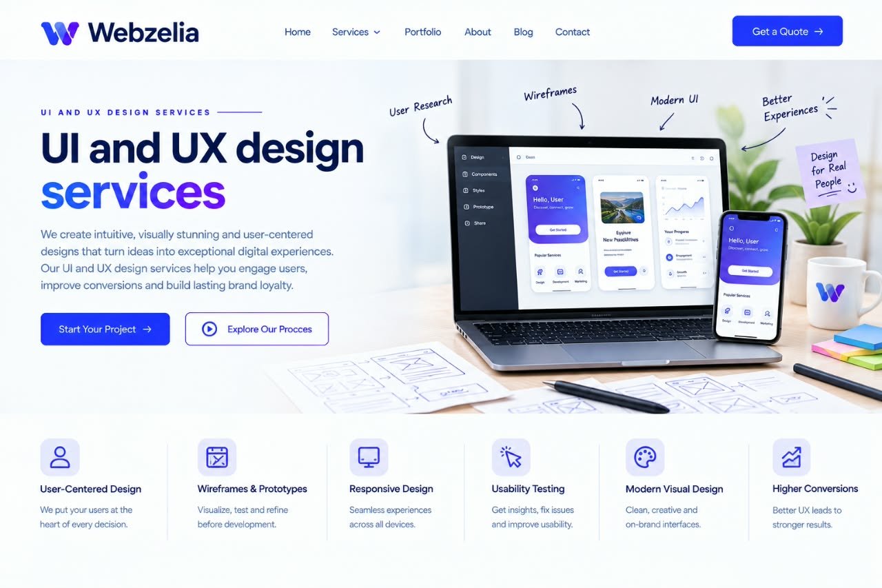
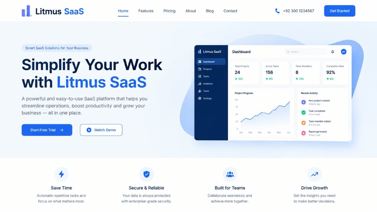
Every extra click, every unclear label, every moment of hesitation is friction. Enough friction and the user leaves. They do not complain. They do not tell you why. They just go somewhere else. Research consistently shows that a bad experience sends users away fast, and that first impressions are formed almost entirely on visual design [citation:13].
But design is not just about looking good. It is about reducing the distance between what a user wants and what your product lets them do. A well-designed flow feels obvious. A well-designed interface feels trustworthy. And a design system means your team can build faster without reinventing buttons every week.
We talk to users, map their goals and pain points, and understand the jobs they are trying to do. Design decisions are driven by evidence, not opinions [citation:6].
We map how users move through your product, where they get stuck and how to structure content so they find what they need without thinking hard.
Low-fidelity wireframes to establish structure, then interactive prototypes to test flows before a single line of code is written.
High-fidelity interfaces with thoughtful typography, colour, spacing and hierarchy. We design for clarity first, beauty follows. The goal is an interface that communicates what matters instantly.
Reusable components, documented styles and clear guidelines so your product stays consistent as it grows, and your developers build faster.
We put designs in front of real users, watch where they struggle, and refine based on what we learn. Testing early saves expensive fixes later.
Every engagement starts with a conversation about where your product is and what is holding it back. We recommend the scope that fits, not the biggest one we can sell.
| UX audit | Design sprint | Full product design | |
|---|---|---|---|
| Best for | Products with usability problems | New features or pages | New products or full redesigns |
| User research | Heuristic review | Light research | Full research and personas |
| Flows and wireframes | Recommendations | Wireframes included | Complete IA and flows |
| UI design | Findings and fixes list | High-fidelity screens | Full UI with all states |
| Prototype | Not included | Interactive prototype | Full interactive prototype |
| Design system | Recommendations | Component library | Complete design system |
| Usability testing | Optional add-on | Included | Multiple rounds included |
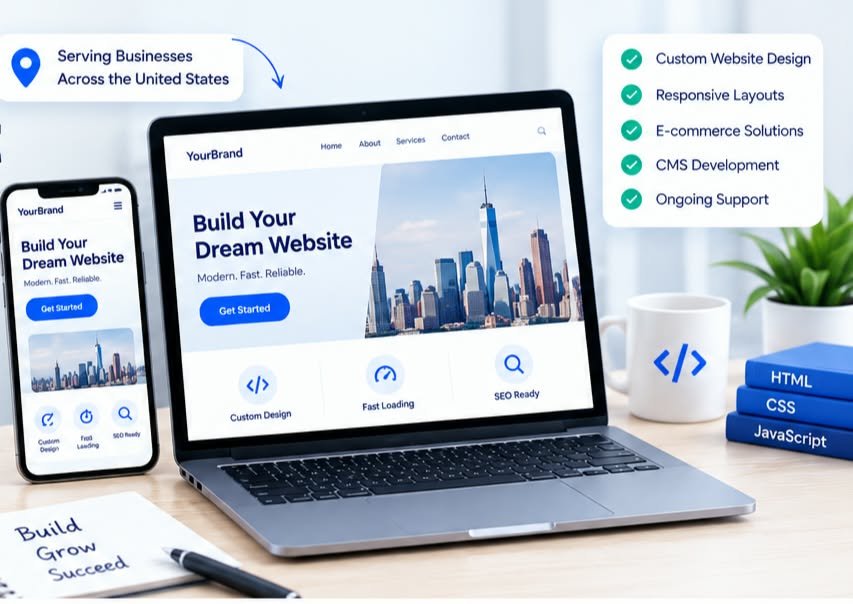
| Developer-designed UI | Template-based design | Webzelia UI/UX design | |
|---|---|---|---|
| User research | None | None | Driven by real user needs |
| Flows | Whatever is easy to code | Generic patterns | Mapped to user goals |
| Visual quality | Functional at best | Looks like everyone else | On-brand and intentional |
| Consistency | Drifts as product grows | Breaks when you customise | Design system keeps it stable |
| Developer handoff | Guesswork | Limited | Documented and organised |
Dashboards, tools and platforms where complex functionality needs to feel simple and obvious.
Custom software where users spend hours inside the product and every friction point costs time and patience.
Product pages and checkout flows where clarity directly impacts conversion and revenue.
Teams building something new who want to get the experience right from the start rather than fixing it later [citation:1].
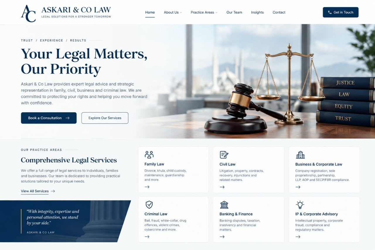
A clean, trustworthy interface that made a modern law firm feel approachable and professional.
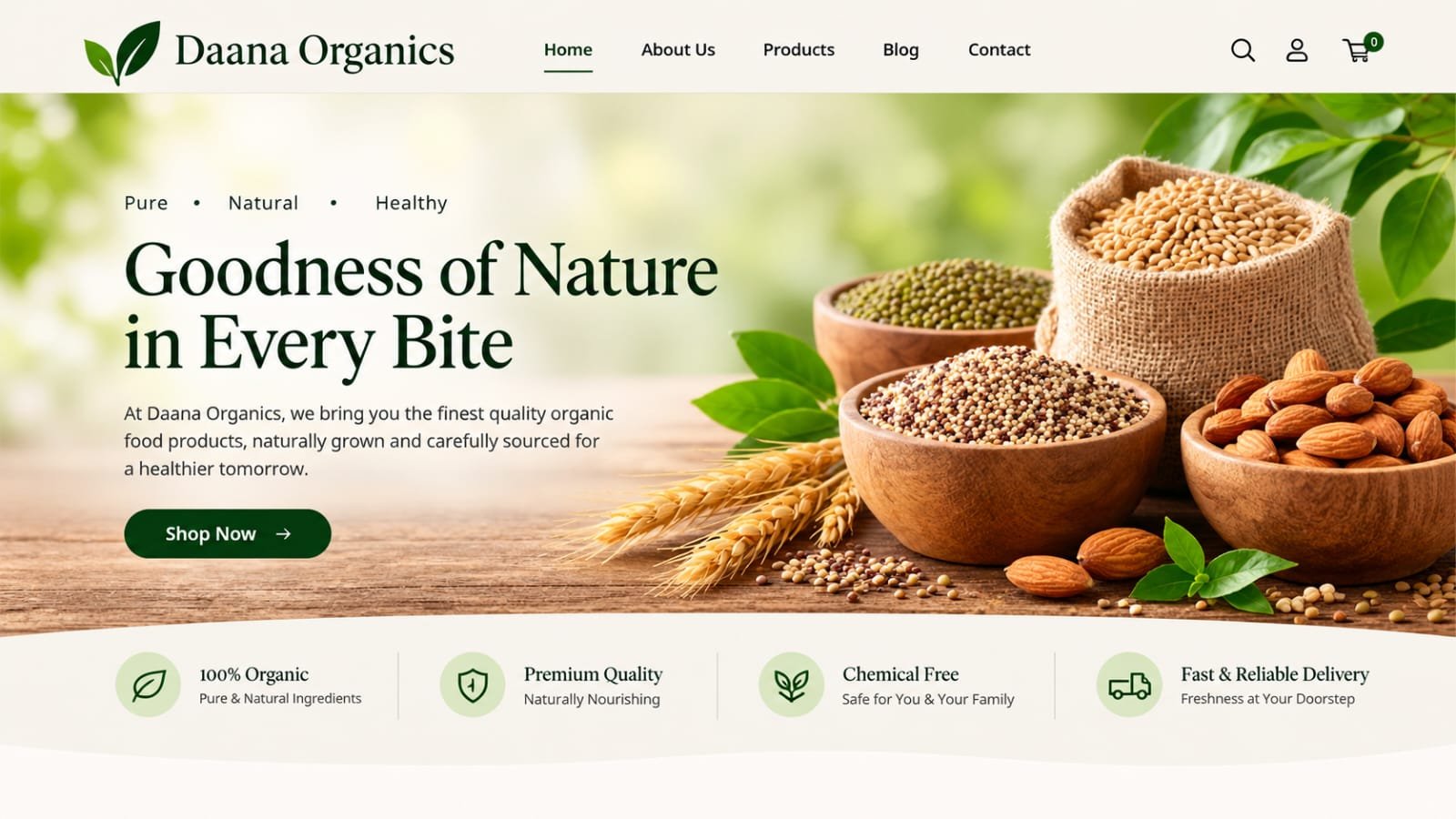
A shopping experience with clear product presentation and a checkout flow that removed hesitation.
A complex data dashboard redesigned to surface insights instead of overwhelming users with numbers.
We learn about your users, your product and your goals. Research, stakeholder interviews and heuristic review. We find out what needs to change before we design anything.
User flows, information architecture and wireframes. We establish the logic of the experience before we touch visual design. This is where the real problem-solving happens.
High-fidelity UI, interactive prototypes and a component library. Visual design that communicates clearly and feels right for your brand. We test with users and refine.
Organised Figma files, documented components and a walkthrough with your developers. We stay available during implementation to answer questions and review the build.
They redesigned our dashboard and the support tickets dropped noticeably. Users stopped asking where things were because everything was exactly where they expected.

The design system they built means our developers can ship new features in half the time. No more debating button styles every sprint.

Our checkout used to lose people at the address step. They found the problem, fixed it, and completion went up. That is design paying for itself.

UX design is about how a product works: the research, the flows, the logic and whether it solves a real user problem. UI design is about how it looks and feels: the visual elements, colours, typography and interactive components. UX is the experience. UI is the surface you interact with [citation:2][citation:15].
Most digital products benefit from both. A product can look polished but be confusing to use, or work logically but look dated and untrustworthy. Good design is where usability and visual quality meet. We offer both, and the scope depends on where your product is today.
A UX audit reviews your existing product to find friction, confusion and drop-off points. It is valuable if your analytics show users are abandoning flows, your support team is flooded with the same questions, or the product simply feels harder to use than it should. We start many engagements with an audit [citation:23][citation:34].
Typically: user research and flows, wireframes, interactive prototypes, high-fidelity UI design and a design system with reusable components. We deliver organised Figma files ready for development, with documentation your team can build from [citation:6].
A focused website or app design takes 4 to 8 weeks, depending on scope. A UX audit can be completed in 2 to 3 weeks. Larger products with complex flows and design systems take longer. We give you a clear timeline before starting.
Yes. We design responsive interfaces that work across screen sizes. For mobile apps, we design natively for iOS and Android conventions. Mobile and desktop are designed as connected experiences, not afterthoughts of each other.
Yes. Accessibility is part of our process, not an add-on. We check colour contrast, keyboard navigation, focus states and semantic structure against WCAG standards. Accessible design benefits every user, not just those with disabilities [citation:16][citation:34].
Absolutely. We deliver design files in Figma with organised components, documented styles and developer handoff notes. We are happy to walk your development team through the design and answer questions during implementation.
Fill out the form or reach us directly. We read every message ourselves and reply within one business day, usually with a few questions about your users and what is not working.
Tell us about your product and where it is struggling. We will reply within one business day with a clear view of what we would look at and how we can help.
Webzelia is a web development and social media marketing agency, building websites, web apps and growth campaigns for businesses across the world. Find out countries we serve.